🎨 Overview
A website’s colour scheme is much more than just an aesthetic choice; it has a significant impact on user perception, trust, and decision-making. The way visitors feel about the colours on your website can have a big impact on whether they purchase, make a reservation, or leave.
In this 2025 guide, we’ll explore how colour psychology applies to web design, why it matters, and how to choose the best colour scheme based on your industry, target audience, and conversion goals.
🧠 What is Colour Psychology?
The study of how colours impact human behaviour and perception is known as colour psychology. It is frequently used to affect users’ emotions and behaviours in branding, marketing, and UX/UI design.
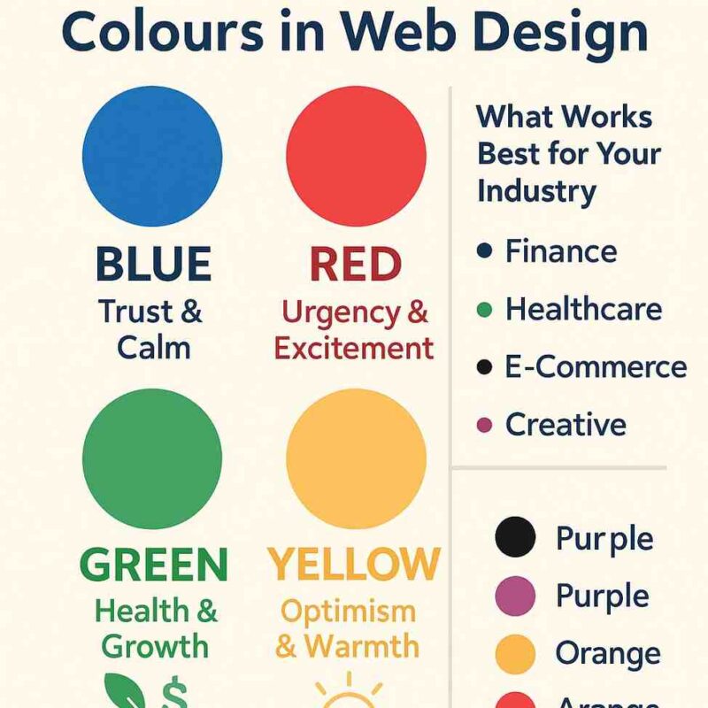
Each colour can trigger specific emotions and reactions:
-
🔵 Blue: Trust, calm, professionalism
-
🔴 Red: Urgency, excitement, passion
-
🟢 Green: Nature, health, growth, finance
-
🟡 Yellow: Optimism, happiness, attention
-
⚫ Black: Luxury, sophistication, power
-
⚪ White: Simplicity, cleanliness, clarity
-
🟣 Purple: Creativity, luxury, spirituality
-
🟠 Orange: Energy, friendliness, affordability
Colour selection is crucial for contemporary websites because these emotional cues affect user engagement and even conversion rates.
🧩 Why Colour Matters in Web Design
-
First Impressions: In just 0.05 seconds, users create an opinion about your website, and colour
-
Brand Recognition: Consistent colour use can increase brand recognition by up to 80%.
-
Conversion Influence: Colours have the power to affect behaviour. On a sign-up form, for instance, blue can boost trust while red might promote urgency.
-
Accessibility & Usability: Make sure your content is readable by everyone, including people with visual impairments, by using contrast and clarity.
📊 Best Colours by Industry (with Examples)
🏥 Healthcare & Wellness
-
Ideal Colours: Blue, green, white
-
Why: Blue conveys trust and calm; green represents healing and nature.
-
Avoid: Harsh reds or deep blacks—they may create stress or tension.
-
Example: A website for a dental clinic that uses soothing blues and stark white backgrounds to give it a polished, sterile appearance.
🏦 Finance & Legal
-
Ideal Colours: Dark blue, grey, green
-
Why: Blue suggests authority and stability. Green links to money and growth.
-
Avoid: Bright colours or too many gradients—they can reduce credibility.
-
Example: A law firm website using navy blue and soft grey to convey reliability and professionalism.
🛍 E-Commerce / Retail
-
Ideal Colours: Red, orange, black, white (depending on audience)
-
Why: Red and orange create urgency and drive action.
-
Use: Contrasting CTAs (e.g. red “Buy Now” button on a white background)
-
Example: A fashion site using black for premium feel and red CTAs to increase sales.
💻 Tech & SaaS
-
Ideal Colours: Blue, purple, white
-
Why: Blue builds trust in digital platforms; purple adds innovation.
-
Avoid: Too many colours—stick with 2–3 max.
-
Example: A software dashboard featuring purple icons, light blue highlights, and a white user interface for a contemporary look.
🧘 Beauty & Lifestyle
-
Ideal Colours: Pink, lavender, beige, soft pastels
-
Why: These colours evoke femininity, elegance, and calm.
-
Use: Softer palettes with rounded elements and whitespace.
-
Example: To appeal to female customers, a skincare brand uses blush pinks and gold accents.
🌍 Environmental / Non-Profit
-
Ideal Colours: Green, earth tones, blue
-
Why: Green represents nature, ethics, and growth; blue adds stability.
-
Example: A conservation organisation is reinforcing their mission by using forest green with sky-blue overlays.
✅ Tips for Choosing a Colour Scheme
-
Start with Your Brand
-
Use your logo as a foundation.
-
Use the same colours on all platforms (website, social media, print).
-
-
Use a Tool to Build a Palette
-
Tools like Coolors, Adobe Colour, or Khroma can help generate harmonious palettes.
-
-
Balance Primary and Accent Colours
-
Use 1–2 primary colours (e.g. background, headings).
-
Use 1–2 accent colours (e.g. buttons, icons) for contrast.
-
-
Prioritise Readability & Contrast
-
Use high contrast for text (especially for accessibility compliance).
-
Run tests with tools like WebAIM Contrast Checker.
-
-
Consider Emotional Triggers
-
Think about how you want visitors to feel—safe, excited, curious?
-
Choose colours that reflect those emotions.
-
🔄 Optimisation and Testing
Selecting a colour is a continuous process; experiment and refine:
-
To compare the colours of CTA buttons, use A/B testing.
-
Use tools like Hotjar or Google Analytics 4 to track conversion and bounce rates.
-
Ask users about their visual preferences and experiences.
🧠 Did You Know?
-
On average, red CTA buttons convert 21% better than other colors—but only when used sparingly and in contrast.
-
Cool colours like blue and green are perceived as more trustworthy.
-
Colour-blind users may not distinguish red/green—so icons and shapes must complement colour use.
📘 In conclusion
Colour is a language, not just a decorative element. You can strengthen your brand identity, influence your audience’s choices, and establish a stronger connection with them by incorporating colour psychology into your website design.
Websites that comprehend the emotional and practical effects of colour will be successful in 2025. Make informed decisions, conduct frequent testing, and keep your user in mind when designing.